Looking back, I have been fairly early into areas like personal websites, blogging and tweeting, always interested to find new ways to learn and communicate. The origins of this website lay in a desire to capture what it was like in the relatively early days of the evolving environmental, social innovation and sustainability movements.
The idea was also to explain to the wider world what we were doing and what was working, and what wasn’t.
A decade in, however, our original webmaster absconded to New Zealand. Still, dark clouds, silver linings. I am still immensely grateful to Geoff Kendall, Sam Lakha and Chris Wash for wading in and rescuing the bulk of the old content.
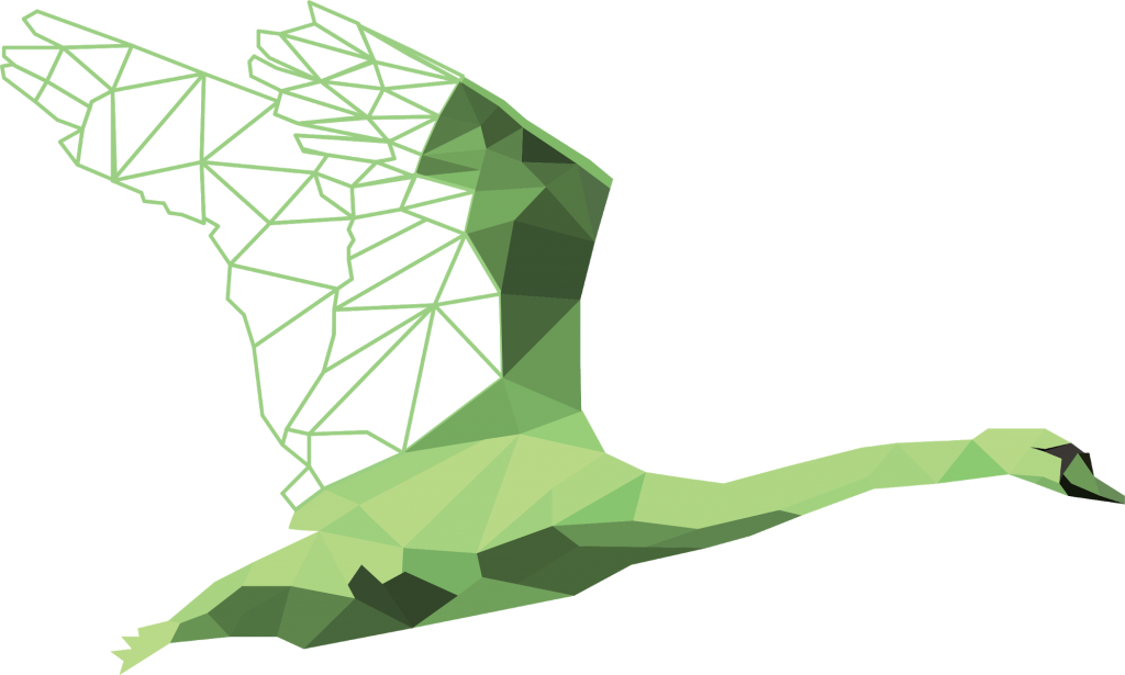
Now the site is evolving for the next stage in my thinking, built around the idea of the Green Swan. More, as they say, anon.
And, by way of background, here is some archive text from the old site which explains some of the original reasoning behind the site:
|
Archive text from 2003, updated 2008 THE BABELFISH AND THE WEBSITE I am often asked what exactly it is that I do. Difficult. When filling in the ‘Please state profession’ line on passports and other forms I have long been tempted to write ‘Babelfish’, which I’ll explain in a moment. And the website? It’s a fairly natural outflow from work I have done under the guise of John Elkington Associates (JEA), founded by Elaine and I in 1983. Later, I changed the name to CounterCurrent. In compiling the original version of the website, with the help of Rupert Bassett and Lynne Elvins, I was forced to plumb my core values, powerfully shaped by pressures and opportunities described elsewhere on the site. Eight values that bubbled to the surface were: – Evolution: Real change happens over generations – Sustainability: Future generations as stakeholders today – Diversity: Evolution feeds on difference – Transparency: Sustainable economies are see-through – Conversation: Wellspring of insight – Memory: Capture lessons of experience – Intuition: Facts only get you so far – Serendipity: Learn from mistakes and accidents. These values also eddy through the visual aspects of the site, including the logo. Click here for Rupert’s explanation below of how the original imagery evolved. And the Babelfish? My work has often run counter-current, hence the imagery of fish swimming against the flow. At Volans and SustainAbility, too, we have aimed to drive the discussion of problems upstream – from symptoms to causes in pursuit of real cures. But maybe the story runs deeper still. I was born in a mill-house cottage on an island in the Kennet, a tributary of the Thames. Later, as a child, I would find myself surrounded by elvers on a moonless night in Northern Ireland, or communing with wildlife along rivers in Gloucestershire, Somerset and Dorset. And once we had decided to use fish for our new logo, the imagery proved surprisingly apt. Fish, it turns out, symbolise reproduction, life, freedom, the emotions, our unconscious, the quest for enlightenment, flashes of intuition, prophecy, fertility, plenty, prosperity, good luck, longevity and rebirth. Salmon, the ultimate homing fish and recently returned to the upper Thames, near our London home, symbolise wisdom – vital in a world flooded with data and information. And that’s where the Babelfish fits in. Brainchild of the late, great sci-fi author Douglas Adams, it was billed as the universal translator. Slip the creature into your ear, we were told, and you could suddenly understand all the Galaxy’s languages. If any one organism symbolises my aspirations, and my work across the turbulent, blurring boundaries between business, financial markets, governments and civil society, this is it. |
Finally, for the record, here is the text in which the original logo designer, Rupert Bassett, explained the origins of the fish logo:

Part of the original CounterCurrent design for this website, by Rupert Bassett
Pre 2008 Design by Rupert Bassett
John’s original design brief was to produce graphic imagery which would convey the idea of “swimming against the stream”, a strong metaphor for his campaigning lifestyle. In addition to this, as he communicates using many different forms of media, I was looking to create a flexible graphic system which could be applied quickly and consistently across multiple formats.
The Generic Form
After some study of streaming water and the mechanics of fish propulsion, I found an answer to the brief in the similarity of the forms involved in “swimming against the stream”. Wave patterns, scale textures, shoal paths and river flows all employ the same sweeping curves.
The solution was to create a single generic graphic form, from which all other graphic imagery required could be built by the simple process of repetition. The generic form was constructed using two dynamic sweeping curves, giving an apparently organic and naturalistic shape, without closely representing any specific identifiable aquatic lifeform.
Repetition
The most effective orientation for the generic form is moving “upstream”, emphasised by a background pattern generated by the repetition of the form which moves “downstream”. The background employs a diagonal repeat in the direction of the “head” of the form which emphasises the movement. More naturalistic patterns can be created by the deletion of a random number of shapes from the regular pattern. Colour transparency adds depth to the background.
The curves of the generic form were very carefully located within a grid structure of regular squares. This grid structure is an essential device to facilitate the regular repetition of the generic form in the creation of graphic imagery, and for the integration of other design elements. Any typographic or photographic forms can be sized and positioned according to the dimensions of the grid.